|
Wash/Flat Wash- an art technique resulting in a partially transparent layer of color
Dry-brush- a painting technique where the brush is dry, but still holds paint. This gives the brush stroke a scratchy look, instead of the usual smooth watercolor look Glazing- layering or stacking color, results in transparent layers that are able to be seen through Graded Wash- a wash that smoothly changes in value from dark to light Hue- a paint that is made up of other pigments, but is close to the original color Intensity- the brightness or dullness of a color Lifting Paint- removing or erasing watercolor from the surface of a painting Masking Fluid- a liquid used to block out areas of a watercolor while you paint, retaining the original color of the paper Palette- a flat surface used to arrange and mix paints, often made of plastic or porcelain, with built in wells and areas for mixing colors Scrubbing- a dry-brush technique used to lift paint or add color to an area of the painting Color Temperature- the level of warmth contained within a certain color. Classified by warm or cool colors Tint/Shade- a tint is a color mixed with white, while a shade is a color mixed with black Transparent- able to be seen through, allows other colors to come through Value- a range of tones that span from white to black. More paint in a mixture darkens the value, and more water in a mixture lightens the value Wet-onto-Dry- wet paint applied onto dry paint Wet-onto-Wet- wet paint applied onto wet paint Wax Resist- a technique using wax that prevents the watercolor from sinking into those areas Salt Technique- salt crystals soak up the liquid from the water color paint, creating areas without as much pigment Watercolor Paint- paints made of pigments suspended in water Blotting- using an absorbent material to lighten a wet or damp wash Watercolor Paper- a special drawing paper with a surface suitable to watercolors Perspective- creating an illusion of three dimensions(height, width, depth) on a two dimensional surface
0 Comments
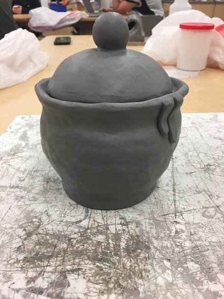 My piece, when finished, will resemble the honey pot from Winnie the Pooh. Instead of it simply being a smooth pot, I will add drops of honey coming down from the top, and the letters will be raised off of the piece. To finish my vessel, I plan to add the letters to the side of the pot, and add some texture to other parts of the pot.
I found that smoothing out the coils to make the body was far more difficult than it would seem, especially when attempting to make it an even curve on all sides. This was difficult mainly because, while smoothing the sides, the pot would become thinner. It required a very careful amount of tapping and smoothing to retain the thickness of the coil, but also seamlessly blend it into the existing clay. The lid was also difficult to shape and curve just how I wanted it, while still making sure it fit into the lip on the top of the pot. While shaving off the excess clay to better fit the shape of the pot, the curve of the lid would begin to flatten, forcing me to hold the lid while working, and make very careful, cautious swipes with the loop tool. So far, I think that the handle and the lip of the pot have been successful. The lip was not easy to accomplish, but provides a nice area for the lid to sit, and a space for the honey to drip off of the edge. My process for the body of the pot was to take a chunk of clay, and make coils, changing the length and thickness of the coils to make the pot spherical. On each coil, I would score/slip to firmly attach them, and use my fingers to smooth the edges together. For the lid, I carved the approximate shape of the lid out of a slab of clay that had been rolled to the thickness I desired. I then fit the lid into its space on the top of the pot, and removed however much clay was needed from the bottom and sides. The pot itself was leather-hard at this point, and so the pressing did not harm the shape of the lip. The handle of the lid was a small ball of clay that was scored/slipped onto the lid. A small, extremely thin coil of clay was then pressed into the space between the handle and the lid, filling in the gap where they met, and providing more stability for the handle.
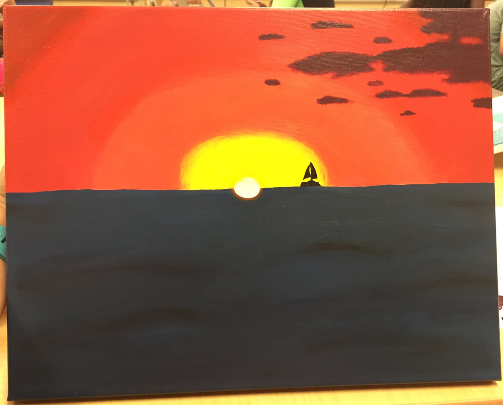
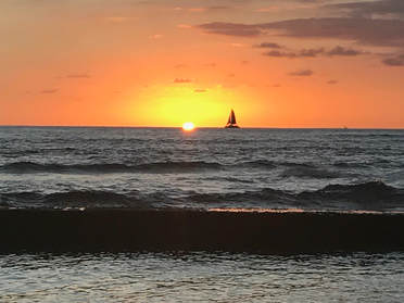
The place represented in my piece is on the island of Oahu in Hawaii. This place is important to me because I love the beach, and have always wanted to go to Hawaii. My parents vacationed there for their 20th anniversary, and this was one of many stunning pictures.
The most challenging part of my painting was the sky. Blending the colors together to make a seamless transition was difficult, and it was made more difficult by the fact that these colors weren't easy to match. The most successful part of my painting was the ocean. I think that the waves turned out well, and that it gives a feeling of movement. The light and dark of the water isn't seen as well in the picture, but provide layers to the ocean. I began with the sunset, adding layers to it as I painted outward. Next, the ocean was painted by a darker first coat, then additional lines of black and a lighter blue. The clouds came next, and were created by splotching a purple and black paint, using more black on the tops of the clouds. Last was the sun and the sailboat, with an orange semi-circle where the sun reflects off of the water. I learned how to mix and create the color paints that I want quickly, and how to better use paint to create different textures.
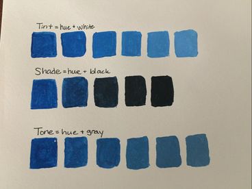
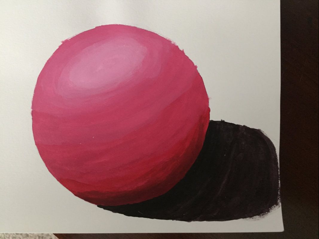
I feel that the color gradient sphere will be the most helpful for my painting, because it features a lot of sky. I learned the most from the color matching assignment, because it taught me which colors to add to get the correct end result, whether it be white, black, or it's opposite. To make brown, you can add orange and blue, yellow and purple, or green and red. To tone down a color, you add gray to the original color.
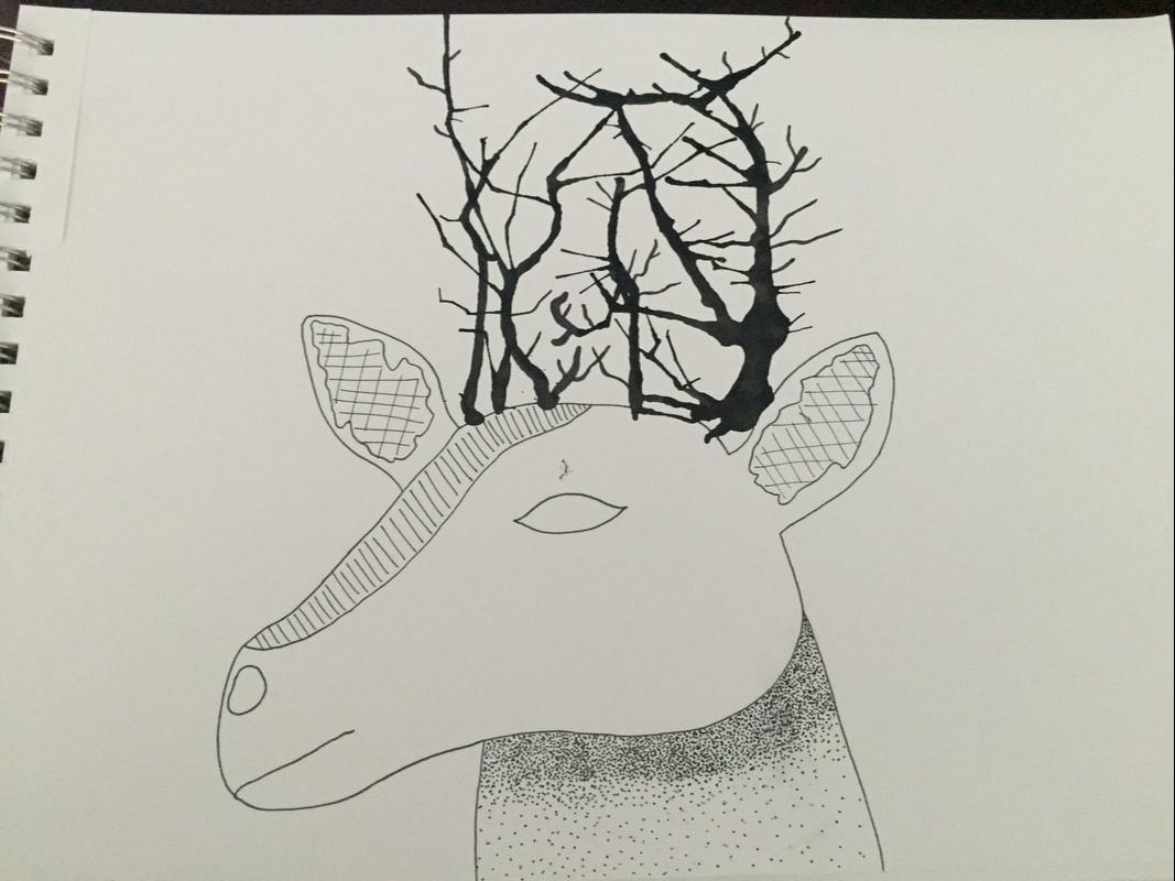
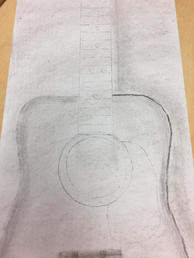
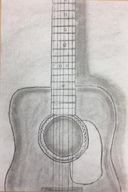
 The most helpful warm-up during this unit was the pen cubes, because we were able to experiment with the different pen drawing techniques before using them on another piece of art. We were also able to see how much you needed to add in order to create different values, and how much time that took to create. Composition- the placement or arrangement of visual elements or ingredients in a work of art Value- element of design that defines the lights and darks in artwork Pen- Pros: able to create more contrast, able to 'outline' the piece Cons: cannot be erased, takes longer to add value than charcoal or pencil
Charcoal- Pros: creates value faster, is easy to erase mistakes Cons: smears easily, small details are hard to accomplish Pencil- Pros: common medium, can make smaller details Cons: does not stand out as much as pen or charcoal, harder to create dark values Weather photographer Marko Korosec found one of Mother Nature's playgrounds atop Mount Javornik in Slovenia, after strong winds and freezing fog formed beautiful ice sculptures. Some of the ice spikes were over 3 feet long, producing some awe-inspiring formations. Mount Javornik is a popular ski spot, but for Korosec, it became an opportunity to capture some great shots. As an amateur photographer myself, these amazing pictures reminded me that the best kind of art is the one that happens naturally, and it's our job to capture it the best we can. The formations look partially fake at first glance, requiring a second glance to confirm that, yes, these are real. That quality is intriguing to me and caught my attention. 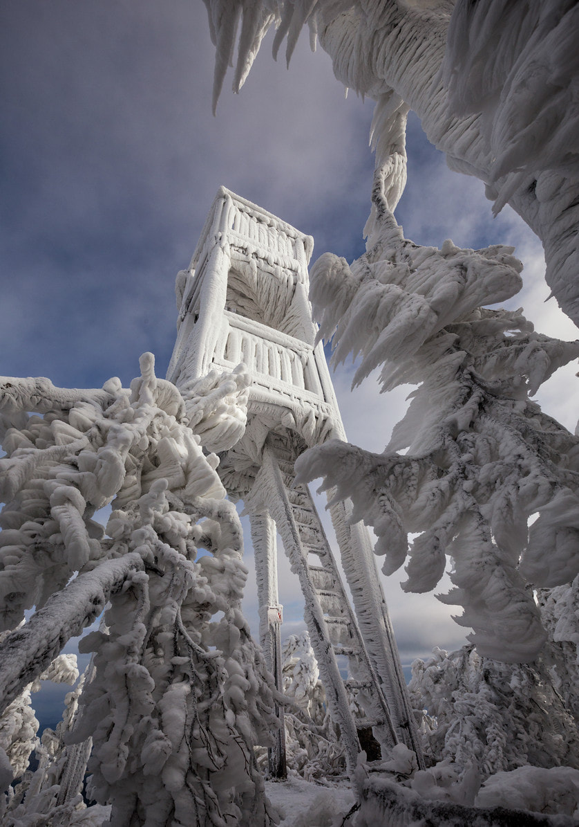 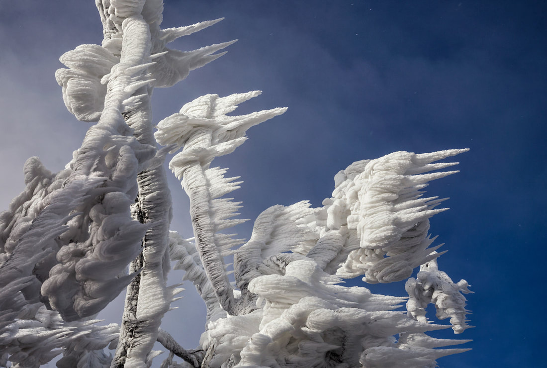 |